Located in Yanji City, Yanbian Autonomous Prefecture, Jilin Province, China, Yanji Department Store, the area’s top revenue earner and one of Yanji City’s most prestigious department stores.
Yanji Department Store has started a floor-by-floor renovation project. Following last year’s renovation on the 6th floor for kids, GARDE was in charge of basic planning, basic design, implementation design, design supervision, and lighting design for the men’s floor on the 4th floor.
Click here to read an article of 6F Kids floor renovation project.
About the Whole experience of the Renovation
The initial impression of the facility before the renovation conveyed a sense of a single flow line and unified spatial design on the floor. While we acknowledged that the tenants and products were well organized, there was a recognition of the need to add a bit more stimulation and change, viewing a commercial facility as something enjoyable.
Consequently, we established the following major directions for the spatial design:
1.”Create features for each floor that align with the tenants.”
2.”Craft a lively circulation with changes in the flow lines.”
3.”Develop a rich sales area with numerous attractions by increasing functions and incorporating eye-catching areas.”
These directives aim to enhance the individuality of each floor in alignment with the tenants, introduce an engaging circulation with dynamic flow line changes, and enrich the sales area with numerous functions and visually appealing elements. The goal is to transform the facility into a dynamic and enjoyable space for visitors.
Design Concept and Key Words for 4F Men’s Floor
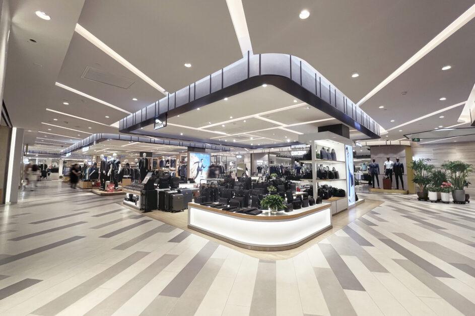
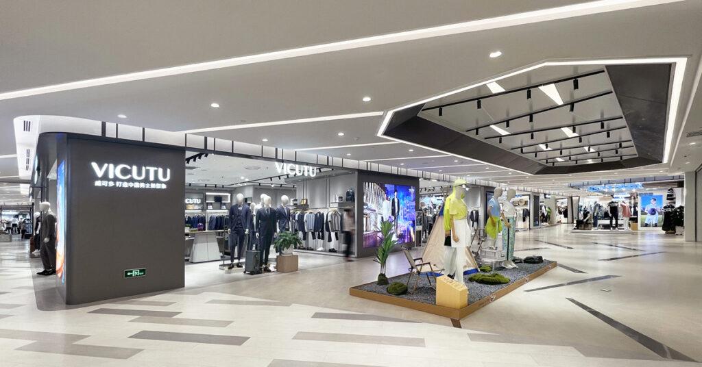
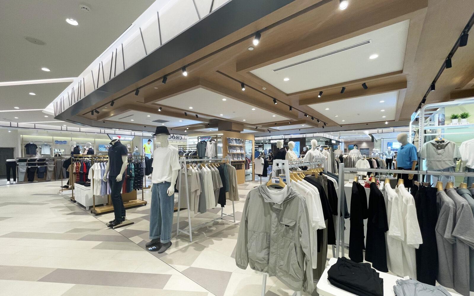
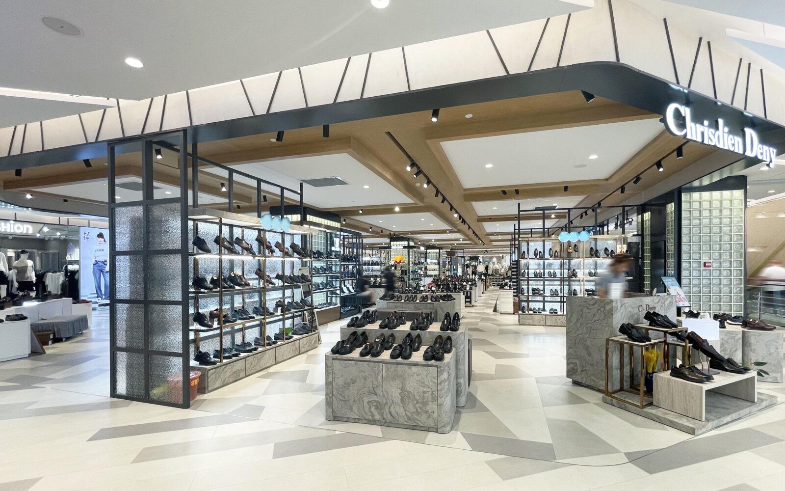
The concept behind the renovation of the 4F men’s floor at Yanji Department Store is “NOBLE MODERN MEN’S LOUNGE” — a vision of a simple, sophisticated, and relaxing lounge space.
Considering the client’s preference for less use of colors and a focus on luxury and texture, the following keywords were employed in the design:
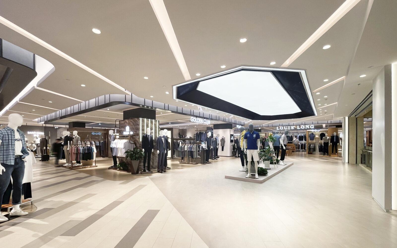
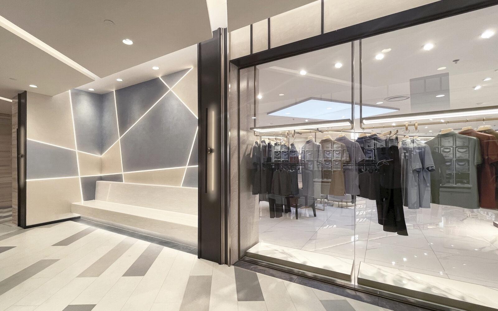
The space was crafted with a gray-beige base color to impart a bright and luxurious ambiance. A monotonous impression was avoided by introducing a variety within the same color scheme.
Line design was integrated to infuse dynamic movement and variation into the entire space, contributing to an overall sense of sophistication.
Geometric designs were strategically employed to accentuate the space, creating a three-dimensional and visually engaging environment.
These three keywords guided the design process, resulting in the successful creation of a well-designed, high-quality space that aligns with the envisioned “NOBLE MODERN MEN’S LOUNGE” concept.
Upgrading tenants and making the floor more spacious by design
There are two main types of sales floors: the wall side section and the middle section. Wall side section have a large floor area and walls to display the products, and are usually occupied by leading brands. On the other hand, the middle section has a limited amount of merchandise and less wall space, so there is a preconceived notion that it is reserved for tenants that are not strong enough to compete. By eliminating this problem, we have reduced the gap between the wall side and the middle section by placing superior stores in the middle section as well, thereby upgrading the tenants on the floor as a whole. To this end, we aimed to make the middle section more attractive, first by improving the flow line advantage, and second by improving the design of the middle section.
Although the above efforts resulted in the leasing of another prominent brand in the middle section, the tenant’s layout requirements were at risk of disrupting the functionality of the floor design.
In order to prevent the creation of walls within the tenants that would create shadows and hide the wall stores, the middle section was designed with a high degree of visibility and design restrictions. As a design supervisor, we were able to prevent the entire floor from becoming closed off and achieve both tenant upgrades and a sense of spaciousness on the floor by persistent negotiation until the very last minute of the opening.
The most Difficult part of the Renovation: Lighting Planning
Lighting is one of the key elements that can significantly change the ambience and impression of a space with a single fixture.
In the renovation of the 6F kids’ floor that we worked on last year, the floor was darker than expected, and tenants in the middle section in particular faced a problem of insufficient illumination without additional lighting.
In China, due to the budget of the construction company, the replacement of lighting fixtures always occurs, and coupled with the Covid-19, it becomes even more difficult to procure the desired fixtures.
By confirming and clearing up the previous issues, while designing for the desired illuminance and effect, and taking into account the risks that may occur on site, we were able to significantly improve the illuminance issue.
The Path to the Renovation of the Men’s floor
Since there are fewer facilities and spaces on the men’s floor of a department store as case studies than on the Ladies’ floor, we communicated with the client a number of times during the image-sharing phase to determine what kind of space would be appropriate for the renovated floor.
For example, we discussed the color balance of the ceiling and floor and the degree of complexity of the design, and we used dynamic diagonal lines on the ceiling and floor in order to create the effect that visitors would circulate to all ends of the floor in terms of flow lines and visually. Through these repeated efforts, we feel that we were able to move one step closer to the ideal space.
Property Information
Name: Yanji Department Store 4F Men’s Floor
Official Opening: May 31, 2023
Location: No.608 Guangming Street, Yanji City, Jilin Province
Design Area: 7600㎡
In the next issue, we will take a closer look at the story behind the renovation of the 2F ladies’ floor of Yanji Department Store.

Pingback: Yanji Department Store Renovation Project #2 -2F Ladies’ Fashion Floor- Garde Design Magazine