The first Hankyu Department store in China, Ningbo Hankyu, opened last April 16, 2021. Being one of the projects developed under the Cool Japan Organization, it took four years for the retail outlet to open after various twists and turns since its start in 2017. GARDE was involved in the exterior and interior design of the aforementioned property.
GARDE has been involved in several opening projects, such as the Nishinomiya Hankyu opening in 2008, the Hakata Hankyu in 2011, and the Umeda Main Store in 2012. This time, GARDE has created a new commercial facility based on the concept of “China’s first experiential shopping mall” that combines the strengths of a department store with those of a shopping center. The project has gotten off to a strong start for a large-scale commercial facility, and its attention has grown tremendously. Therefore, in response to an enthusiastic request from within the industry, Hankyu Department Store held a seminar on May 28, 2021, on “Keys to Success in Developing a New Style of Commercial Facility”. The seminar was attended by about 80 people from local department stores and shopping centers, and GARDE, which was involved in the concept work and design of the project, gave a presentation.
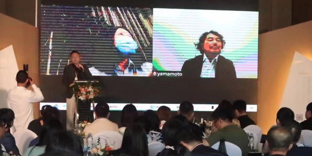
Yutaka Yamamoto, the design director, took the stage remotely from Japan. The following is an excerpt of Yamamoto’s speech about the design of Ningbo Hankyu.
• Concept
When we created the concept, we had two major things in mind. The first was to create an oasis where people can gather and spend time comfortably, as Ningbo is a new urban area that will continue to develop. The second is to introduce Japanese content, not simply by expressing traditional Japanese culture as it is, but by incorporating it into a modern design that is sublimated.
The concept that emerged was “J FOREST GARDEN”. The concept is based on three elements: “J Culture” = traditional Japanese culture, “Nature” = nature motifs, and “Modern” = contemporary.
• Floor Expansion
The sales floor area of Ningbo Hankyu is about 2.5 times larger than that of the Umeda flagship store. We paid close attention to the spatial configuration of the entire building so that customers can move around this large sales floor without getting bored.
Since one floor is too spacious, a single worldview may bore customers. Therefore, we divided the space into three zones to create the pleasure of circulation. The central area of each zone has a dynamic ceiling design unrestricted to the guidelines, emphasizing the changing zones.
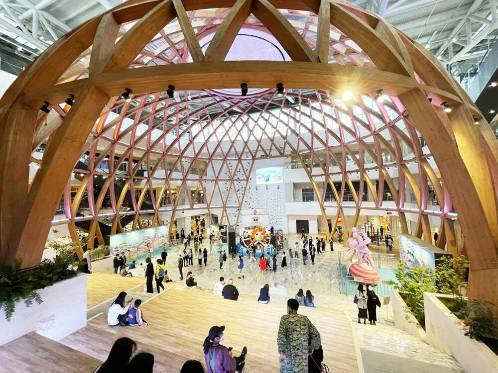
Each floor has a different design theme in order to create a space where visitors can enjoy the experience of a different worldview spread vertically. In the central zone, the plaza connected by the atrium between the 2nd and 3rd floor, and the Gyeongjeon Plaza between the 4th and 7th floor, which is the centerpiece of the entire building, are positioned as the central core of a vertical axis. The dome is inspired by the traditional Japanese architectural technique of woodwork and was designed by sublimating the traditional Japanese technique into a modern design. This is the center of the museum, where visitors can relax on the grand staircase and where large-scale events are held to introduce various goods, activities, and cultures from around the world. We designed this dome as a symbolic space in which people gather to see it and have it etched in their memories.
 Qingti Plaza in the central zone on the 4th floor
• Exterior Design
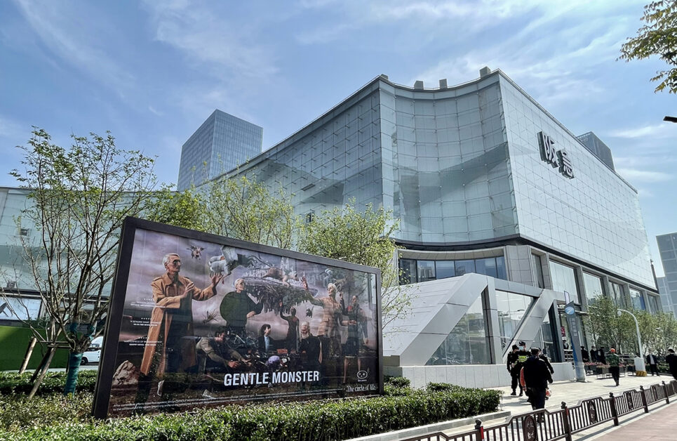
The design includes a welcoming entrance, as we wanted to create a striking yet friendly design that conveys the richness of nature and hospitality that is symbolic of J FOREST GARDEN.
The curtain wall of the upper level is based on the image of “water and forest” as its nature-themed, expressing natural and soft streamlines such as flowing water and ridges of mountains showcasing a forest design. The building is also designed to create beautiful shadows using light, making it an iconic landscape of the new city center.
The lower levels are designed to resemble trees in a forest, using branches and leaves as well as a modern stone pattern where the height was adjusted to attract people to the installation.
The north and south entrances, which serve as the faces of Ningbo Hankyu, symbolizes Hankyu elegance, the DNA of the Hankyu Department Store, expressing the high-quality standards of the brand.
The entrance façade design consists of custom-made reliefs featuring waves, flowers, stars, and sandstone (Crema Marfil) as part of the brand DNA, created together with the Hankyu Department Store when the Hankyu Umeda Main Store was rebuilt.
 Exterior appearance
In many ways, this project was the culmination of all of Hankyu Department Store’s design work to date.
Ningbo Hankyu, being born in Ningbo, represented the sublimation of its history and tradition nurtured in Japan and their future is to attract more and more attention from the public.
Property Information
Location: No. 189, Haiyanbei Road, Yinzhou District, Ningbo, Zhejiang Province, China
Total commercial floor area: 176,000m2 (6 floors above ground and 1 floor below ground)
Number of tenants: 380 stores
Scope of work: Exterior design, interior design
Design Director
Yutaka Yamamoto
Director, Design Division, Design Department 1
Yutaka Yamamoto is active in the design and direction of large commercial facilities including department stores. He oversaw the design of the sales floor for the Hankyu Umeda Main Store renovation project and the general direction of Nishinomiya Hankyu. He was responsible for the design of the 3rd and 4th floors for the entire renovation of Ginza Mitsukoshi. Overseas, he directed the renovation of the entire DOOTA building in Seoul, the new PARKSON Johor Bahru store, etc. In 2019, his project was the watch section on the 5th floor of Isetan Shinjuku. Yutaka Yamamoto is also the general design director of Ningbo Hankyu, which opened in 2021, and has extensive experience in designing large commercial facilities in Japan and overseas.
No related posts.

