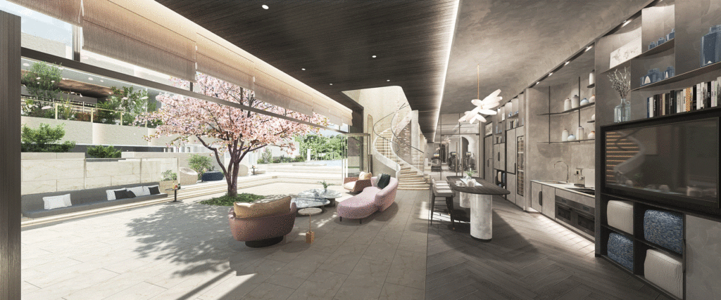
GARDE designed the clubhouse for BAKER CIRCLE ONE, the first phase of Baker Circle, a large redevelopment complex project in the Hong Ham area by Henderson Land, the No. 1 developer in Hong Kong. GARDE designed the clubhouse for BAKER CIRCLE ONE.
The clubhouse, based on the concept of “Blooming”, employs elements with a “Japanese” feel. We designed a minimalist, fresh shared space.
On June 21 (Tue), a large-scale press conference was held for the Hong Kong media, and GARDE’s President Mr. Muro and design director, Mr. Saito, participated remotely on behalf of GARDE.
We then interviewed the design director, Arata Saito, who was in charge of the design of BAKER CIRCLE ONE’s clubhouse.
■About the design concept
First, the client asked us if we could create a design with a Japanese motif. Since a normal reproduction of a Japanese space in Hong Kong would be too colorful, we decided to provide an unusual design with Japanese elements.
In this context, we have designed an elegant space that is wrapped in an organic atmosphere such as a flower petal, while using the shades of light as the key concepts. It is a space where you can feel the 365 days of time pass and the changing of the seasons. The soft and elegant curves of the petals were used as a motif to create a fluid and gentle atmosphere through the use of materials, colors,and lighting.
For example, we did not use very strong lighting, but, rather, used a lot of indirect light. The walls and ceilings were kept as simple as possible, and the shadows of petals and greenery cast by the indirect light spread over them, giving the space a deep, restful feeling.
Of course, each season is influenced by the environment, but we hope that you will see this as a plus and enjoy experiencing each moment created by the changing seasons and time.
■Baker Circle One Clubhouse Design Features
We designed each of the three buildings as shared spaces with different functions and purposes so that friends, family, and residents can use them in their own way and with their own hobbies and interests.
Indoors, there are cultural activities such as a yoga space and library. Outdoor activities include a rooftop garden, fruit garden, BBQ site, playground, and activities such as a rooftop garden, fruit garden, BBQ site, playground, and urban farm, making it a unique and highly satisfying space.
■About Lounge Design
We have designed lounges for each of the three buildings. In this issue, we will discuss the lounge designs for two of the three buildings.
The design of the first building (Top Image), with its beautiful cherry blossom trees that seem to depict the life force of nature as is, is impressive. By eliminating the boundary between the outdoors and the indoors, we planned the space to be as spacious and rich as possible within the narrow living environment of Hong Kong.
In addition, in order to fulfill the various needs of users, the wall side is designed as a multi-function wall. This is a place where the sharing of space is strongly emphasized due to the diverse use of the space.
The staircase leading to the rooftop garden on the third floor has a bold curved design that expresses the softness of the space.
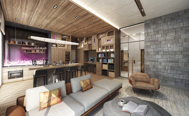
Next, the design of the second building (Image 1) was designed with the intention of creating a more Japanese feel, and the use of latticework, as well as andon-style wall surfaces, and rough-finished stones further emphasize the shadows.
By daring to switch the design of the flooring and the ceiling, we created a space where people can spend time comfortably and feel a sense of peace by giving the space a sense of liveliness.
■About Yoga Room Design
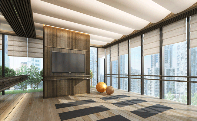
We designed a yoga room as one for cultural activities. The large windows overlooking all four sides allow plenty of natural light to pour in, while the low-brightness lighting and curvilinear design of the ceiling create a sense of openness and soft light that softly envelops the body and mind.
In addition, the warmth of the wood flooring may be described as a “yoga space in the sky” that relaxes not only the body but also the mind.
■About Library Design
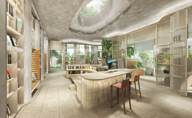
The entire space is unified by the earthy tones, with fin-like wall surfaces, wavy latticework, and skylights that resemble flower petals.
From the ceiling floods a sparkling natural light similar to the brilliance of water, and the balcony space with its lush fruit garden allows you to feel the airiness of the plants. We have created a space where you can experience the luxury of being surrounded by nature while still being in the big city.
■About Art Space Design
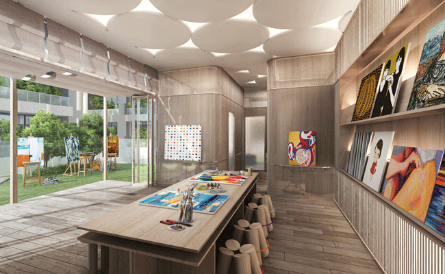
The simple wood-based space is filled with soft natural light, and together with the various artworks, we believe that visitors will be able to feel the slow flow of time.
The ceiling is made up of rounded parts, and wooden chairs are used to incorporate a playful spirit that reminds us of the free creations we made in our childhood gardens.
We designed this space to be a gentle place where people can forget the hustle and bustle of daily life and calm their minds.
■About Staycation Room Design
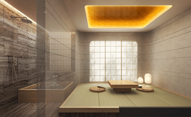
With the restrictions of international travel still in place, we designed a space where people can experience “wa”, or Japanese sensibilities, which is an extraordinary experience. By adopting materials that are “wa” in terms of both sight and smell, such as tatami mats, latticework, and washi paper lighting, we were able to express a minimalist, lean, “wa” atmosphere.
■About Gym Space Design
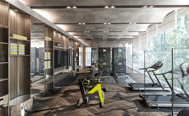
Brilliant outside light pours in through the wide-open windows, and skylights on the exterior portions of the building create a sense of openness. Roman shades were employed to adjust the amount of sunlight.
The wall accented with soft curves is based on the motif of Japanese folding screens. We hope you can feel the “harmony” here as well.
■Desiner Profile
Arata Saito Design Division, Design Department, Design Director, First Class Registered Architect


