Project

Candeo Hotels Kyoto Karasuma Rokkaku Kyu-Banke Residence – Transforming a Kyoto Cultural Property with Modern Design

Candeo Hotels Kyoto Karasuma Rokkaku opened in June 2021. GARDE was involved in the conceptualization, facade, basic planning, basic design, and project supervision.

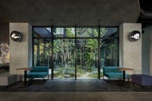
The main feature of this hotel is that it is a redesign of a traditional Japanese townhouse, the “Former Banke Family Residence,” which is a very valuable registered tangible cultural property of Kyoto City. In particular, the tatami room, which consists of the main room and the next room, has been finished in the sukiya (Japanese traditional tearoom) style, with bark surface pillars and screens. In addition, the main room has a floor, shelves, and a hirashoin (non-projecting study window), and the shelves are decorated with ink paintings by artist Ike no Taiga. In order to maximize the charm of the house, the tatami mats in the reception room, lounge, and bar have been retained, and the original courtyard has been preserved so that visitors can enjoy the Kyoto townhouse style, while relaxing from the reception room on the first floor.

The combination of Kyoto’s traditional architecture and culture with modern technology and techniques, as well as a wealth of wisdom, has resulted in the creation of a unique Machiya experience in Karasuma, Kyoto. It is a “Cultural Experience Facility” and a “Machiya” that allows guests to experience Kyoto culture as if they were living there.

* What is the Banke Residence?
The Banke family was born in Omihachiman-cho and moved to the present location in 1896, where they have operated a kimono wholesale store for generations. The main building was built in the omoteyazukuri style, with an entrance building connecting the store building and the residential building in the back and is thought to have been in its present form in 1911. Architecturally, the tatami room is particularly noteworthy. The tatami room, which consists of the main room and the next room, is finished in the sukiya (traditional Japanese tearoom) style, with bark surface pillars and screens. The details are elaborate, and the design is excellent. Although the main house has been slightly altered, it retains the atmosphere of a traditional Kyoto townhouse. In addition, there is a tendency for townhouses in Kyoto to renovate only the tatami room during the Meiji and Taisho periods.
The tatami room of this house is one such example, showing the trend of townhouses in modern times.
(Registered in Kyoto City on April 1, 1991.)
(Quoted from the signboard of Kyoto City Historic Site)

【Design】
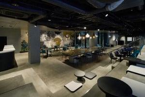
The hotel consists of three buildings: a reception building, a guest room building, and a public bath. The reception building, which serves as the entrance to the hotel, is a redesign of the former Banke family residence*, is a registered tangible cultural property of Kyoto City. The earthen floor itself has been left as is, creating a space that gives the impression of an alley in Kyoto. In addition to the lounge, a library and bar space have been created to increase your experience, and to make your stay more fulfilling.

●Reception Building
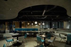
The reception room, bar, and lounge are followed up by the tatami space. In the reception room on the ground floor, the sliding doors are decorated with ink paintings by Ike no Taiga, a literary painter from Kyoto, and an entranceway scented with sandalwood, reminiscent of Japan, creating a relaxing space. In the bar on the second floor, the hanging lights on the street floor seen through the latticed windows create a scene resembling lanterns displayed at a festival, creating the feeling of living in a traditional Japanese townhouse.
The earthen floor, which has existed for ages, has been turned into a dirt floor, creating a space reminiscent of the alleys of Kyoto.


Left: Entrance   Right: Tsuboniwa(Inner Garden)


Left: Reception room on the ground floor  Right: Tori-Doma (Passageway of Earthen floor)

●Guest Room Building
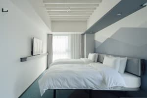
While utilizing the characteristic straight lines of Japanese architecture, we introduced unexpected Western finishes such as travertine colors and warm pink bronze details in the patterns. By incorporating walnut, we created a space surrounded by a sense of luxury.
The gentle impression of the travertine and the indirect view of the townhouse reflected in the metal parts create a modern design while maintaining a sense of harmony with the historic architecture of the townhouse.


Left: Suite room   Right: Twin room

●Public Bath Building

◆About Candeo Hotels Kyoto Karasuma Rokkaku
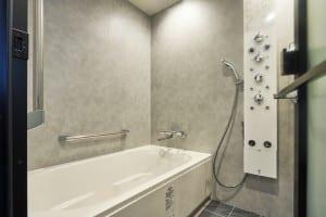
The 10-story hotel has 106 rooms, including 2 rooms with private spa facilities. The hotel also features the largest bath in the Candeo Hotels chain, which is an outdoor bath with a pleasant breeze blowing through it, allowing guests to bask in the fresh air. The men’s bath has a dry sauna and a water bath, while the women’s bath has a mist sauna, providing a delicate space where you can relax and refresh yourself after a long day of sightseeing in Kyoto.

During the Gion Festival, the busiest time of the year in Kyoto, a jomyoyama float is assembled in front of the hotel. As well as being both functional and well designed, the Candeo Hotels Kyoto Karasuma Rokkaku is an exquisite and unique hotel where you can feel the Gion Festival at its closest.

Facility Overview
–     Official name: Candeo Hotels Kyoto Karasuma Rokkaku
–     Location: 149 Konyadori, Karasuma Nishiiru, Rokkaku-dori, Nakagyo-ku, Kyoto 604-8064
–     Site area: 828.99m2
–     Building area (built-up): 619.95m2
–     Floor area subject to floor area (all floors): 3302.55m2
–     Height: 31.00m, 10 floors above ground      
       *Only the guest room building and public bath are included.

Scope of Work
Concept planning, facade, basic planning, basic design and project supervision

Hotel ARU KYOTO, a “Taisho Romance” in Kyoto’s Sanjo Kiyamachi district. “A modernist worldview created by an Italian designer is ‘there’ (ARU)”

GARDE carried out the grand opening of HOTEL ARU KYOTO on Sanjo-Kiyamachi Street in Kyoto in July 2021and was involved in the conceptualization of the façade, planning, basic design, implementation of design, and general supervision of the project.

The space overall, is a well-balanced and elegant combination of Japanese and Western elements, transporting guests into the world of Taisho Romanticism. It features Western damask wallpaper and traditional Japanese house ceilings and tiles, European furniture, Japanese wooden lattices, and Western style stained glass.

Background of the birth of HOTEL ARU KYOTO

The world of Taisho Romance, a modernist Japan of about 100 years ago, as interpreted by an Italian designer.
Italian designer Francesco Ristori was in charge of the design of this property. He studied architecture at the University of Florence and continued to work on residential and retail design as well as the restoration of historical buildings in Italy before coming to Japan in 2014, after which he joined Garde. 

To date, he is still involved in projects that allow him to demonstrate his experience and customs in Italy. So why “Taisho Romance”? Italians and “Taisho Romance” – At first glance, seems incongruous. However, the key to the success of this project lies in that “sense of incongruity”.


The encounter between the Italian designer and “Taisho Romance”.
He first discovered Taisho Romanticism when he joined the project, a style of Japanese art and culture expressed through a unique worldview. At first, he had the impression that it resembled the Western style, but as his learning deepened, he was impressed by this unique worldview created by incorporating new interpretations into Western architecture and art.

The more you learn about Taisho Romanticism, the more fascinated you become.
The Taisho era (1912-1926), which lasted only 15 years after the Meiji era (1868-1912), was a time of modernization and a blend of Japanese and Western culture. It was a time of contrasts between light and shadow, with urban glamour, but also social unrest caused by economic stagnation. He felt “a gentle melancholy and a spiritual longing” for the architecture and art that had a somehow somber atmosphere in contrast to the glamor of the era.

The Design of HOTEL ARU KYOTO
The overall design takes in the culture of the past and sublimates it with modern technology and taste in order to create a new space. It is not simply a matter of reviving an old-fashioned atmosphere but also creating a place where people can experience “Taisho Romanticism” in Kyoto, a new purpose to visit the city. He believes that it is a sustainable design that will generate modernism 100 years from now.

Click here for the designer profile
https://www.garde-intl.com/aboutus/?lang=jp

● Introduction of Facilities

The word “ARU” (meaning to exist in Japanese) refers to a hotel that continues to exist in a place beyond time. Sanjo-Kiyamachi Street was once a bustling lumber wholesaler district along the Takase River. Throughout the Edo, Meiji, and Taisho eras, the town was influenced by Western culture, but the universal values and the romanticism rooted in the town have been passed down from generation to generation.

While preserving the history and traditions of this town, the hotel creates new values and culture to weave a better future. Without being bound by a framework, they continuously incorporate new cultures. During this time, unique cultures were born in many fields such as architecture, design, and entertainment, including stonework and brick architecture, Japanese and Western interiors, and culturally, the establishment of the Takarazuka Revue and the popularity of cinema. HOTEL ARU KYOTO was born from the inspiration of a one-of-a-kind era and the architectural style of “Taisho Romance”.

Front desk with a chic and modern interior.

Rooms with pleasant light coming through the stained-glass windows.

The designer’s favorite authentic bar counter made of a single piece of wood. The dim, atmospheric lighting gives the place a “Taisho Romantic” air.

The rooftop overlooks the beautiful scenery of Kyoto and can be enjoyed as a beer garden in summer.

Facility Overview
–    Official name:HOTEL ARU KYOTO
–    Location: 48 Daikoku-cho, Sanjo-shitaaru, Kawaramachi-dori, Nakagyo-ku, Kyoto 604-8031, Japan
–    Use: Hotel (55 rooms, including 1 barrier-free room)
–    Scale: 9 stories above ground
–    Height: 29.50m
–    Structure: Steel-frame construction
–    Site Area: 391.44m2
–    Building Area:1707.30m2

Scope of work
Concept planning, facade, basic planning, basic design, implementation design, and supervision

Rebranding of Chinese women’s fashion brand “LANCY” and branding design for the new brand “L By LANCY”.

GARDE designed the first store after the rebranding of Chinese luxury women’s fashion brand “LANCY” and the first store of the newly launched second line “L By LANCY”, starting from the conceptualization, basic planning, basic design, implementation design and supervision.

Since its establishment in 2000, LANCY has been a high-end women’s fashion brand that offers fashion for every occasion, targeting sophisticated urban women with charm, experience, and influence. Competition in the Chinese women’s fashion market is becoming increasingly fierce as average incomes rise, needs diversify, and markets become more fragmented. While the trend toward casual and street fashion continues, there is also a growing emphasis on “brand value”, and there is a stronger demand for brand reliability, not just luxury. In response to this trend, the mission was to redefine the brand value of LANCY and to brand L By LANCY, which had been handled by the same store, as a new brand.

LANCY
We aim to support sophisticated women living in the city by dressing them with unique styles. We also hope to deliver love and power to the world while increasing consumer empathy for the brand value. The concept of the store design is “My place, My time”. With the image of a “mansion” where the girls live, we created a sophisticated yet relaxing space by using high-quality materials and bright, warm tones throughout. In the store, a “gate” is placed as a symbol of a “mansion,” and by changing the material of the floor, a space with different expressions to create to atmosphere of the space. We were conscious of carefully expressing delicate femininity with fine details by creating a luxurious space using the brand’s original LC pattern. We believe that customers should feel what the brand represents as soon as they step into the store.

Inside the LANCY store

L By LANCY
While maintaining the elegant and sophisticated worldview of LANCY, the brand targets a wider and younger audience. Based on the design concept of “My place, My time”, the space is designed to communicate the glitz and glamour of the brand.  Their customized chandelier features the L By LANCY logo displayed in the center of the store that creates a very festive and inviting atmosphere.

Inside the L By LANCY store

Scope of work
Concept planning, basic planning, basic design, implementation design, supervision by Garde

Gurney Food Hall, one of the largest and hottest dining establishments in popular tourist destination Penang, Malaysia

GARDE designed the interiors of Gurney Food Hall, a new upmarket dining establishment at Gurney Plaza, one of the biggest and most popular shopping malls in popular tourist destination Penang, Malaysia. GARDE was also awarded the “Asia Pacific Property Awards 2021-2022” under the category of Interior Design/Leisure Interiors.

Opened in October 2020, Gurney Food Hall is fast gaining popularity as Penang Island’s largest and most exclusive dining establishments, with a maximum capacity of 600 people, making it one of the most talked about restaurant mall in the world. Located in the Straits of Malacca, western of the Malay Peninsula, Penang Island has long been a port of call for trading ships and is one of the most important gathering places in Southeast Asia. Penang has a rich and diverse culinary scene and is consistently ranked as one of the world’s top culinary destinations.

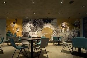
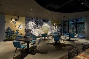
The theme for the design of the new food hall features history of the city and its food culture are deeply intertwined. It was designed to create a sophisticated space that conveys the culture, food and art of Penang Island. Garde decided to divide the space into four zones: the Wharf, the Harbour, the Palm and the Patio, all of which are icons of the city and symbols of its success and development.

The “Wharf Zone” is the first place where traders set foot on Penang Island. The cool, crisp blue of the sea and the arched entrance provides a nice welcome to its guests. The ‘Harbour Zone’, a bustling and vibrant area  symbolizes the industrial heart of Penang. The “Palm Zone” represents the rich nature of Penang with traditional handicrafts that translate into a warm and serene space. Finally, the ‘Patio Zone’ is an inviting area bathed in sunshine. Whichever zone one visits, one is assured of a pleasurable experience including outstanding meals with a taste of Penang’s scenery.

The Wharf showcase contemporary street lamps and building signs

The Port is adorned with a nautical motif

The Palm features lush trees and rattan lamps that give a native feel

The Patio presents a grand abstract wooden obche with light curtains

Winner of the Asia Pacific Property Awards 2021!
Interior Design category Leisure Interior category


About the Asia Pacific Property Awards
The Asia Pacific category of the International Property Awards, organised by International Property Media Ltd. It is the most prestigious and widely recognised design award in Asia. Now in its 27th year, the awards recognise excellence in commercial and residential real estate in 25 countries and territories in the Asia Pacific region in categories such as Development, Architecture and Interior Design. Around 80 experts rigorously judge the entries, focusing on design, quality, service, innovation, originality and commitment to sustainability.

Scope of work
Concept planning, basic planning, basic design, implementation design, design supervision

Property Information,
Gurney Food Hall
Opening date: 15 October 2020
Location: 4th Floor Gurney Plaza, Gurney Drive, 10250 George Town, Penang Malaysia
Structure: 4 floors above ground (4th floor)

Tokyo Tatemono, Project to Relocate Head Office – New style office where lively workers generate a new energy.

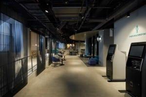
In 2020, GARDE was involved in the relocation project of Tokyo Tatemono’s head office, and was responsible for concept planning, basic and implementation design, as well as project management. Located in front of the Yaesu Exit of Tokyo Station of the former company’s headquarters, it has become the new target for a large-scale redevelopment project. The company decided to relocate its head office functions to the Tokyo Tatemono Yaesu Building and will take approximately five years until completion. Tokyo Tatemono has been providing offices for various large-scale projects based in the city center, situated in middle of the global city of Tokyo. 

GARDE’s concept of office design
Last year, the concept of “redesigning the way we work,” was launched and started in 2019. Garde’s objective was to take the concept of ABW (Activity Based Working), which has been popular in Japan since around 2018 and take it a step further and embody it into office design.

Companies are expected to provide a comfortable environment for better work-life balance, or more specifically, their QOL, and enable them to perform at a higher level. This will lead to improved productivity and business performance, and ultimately to the realization of sustainability as a company. Garde designs the office in such a way that each employee can excel and their energy and productivity can influence other team members and departments to create new value and evolve as individuals.

Design Concept
What GARDE proposed for Tokyo Tatemono is an office that creates a new “flow”; a small but vigorous flow that starts with an individual or a small team, that will become an even larger flow involving those around it. The value created by this flow will ripple out into the city, and eventually return from the city to the office, which is the underlying image of this design.

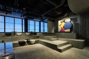
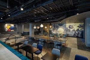
The mechanisms for creating flow are arranged in a variety of ways. Not only are there free-address desks in the department available, but there are also several spaces that can be used for multiple purposes, rather than simply allowing people to freely choose their seats. For example, by removing barriers and creating free lines of flow, some areas are open so more interaction and cooperation can naturally occur, while others can be made to be moderately closed off in order to enhance focus and concentration.

Atelier Zone
Work can be done in a space that inspires creativity, surrounded by bookshelves lined with specialized texts.

Park Zone
Adding greenery to the space, giving the comfort of being in a park and induce imagination 

Scandiamoss
A wall of soothing natural moss creates a relaxing space and enables communication that transcends barriers

Concentration booths
Quiet booths that block out sound increase concentration and work efficiency

Creating a comfortable space based on data
Another feature of this office is that, not only is it beautiful and comfortable from a sensory point of view, but its layout and capacity have been determined based on data-based analysis. For this office relocation project, Tokyo Tatemono conducted a survey of the hourly attendance rate of employees, the distribution of where they tend to stay, and the occupancy rate of conference rooms, including an online questionnaire for employees. By incorporating various indicators into a matrix, Garde was able to survey each space and uncover problem areas. By reflecting the results of this analysis in the design, Garde produced a more effective work environment, providing a space that matches the actual situation.

Scope of work
Concept planning, basic planning, basic design, implementation design, supervision
Scope of floors: 2F, 3F, 5F, 7F, 8F, 9F, 10F (*Floors 2F, 3F, and 5F are partial)

Property Information
Location: Tokyo Tatemono Yaesu Building, 1-4-16 Yaesu, Chuo-ku, Tokyo
Scale: 10 floors above ground, 2 floors below ground
Area occupied by Tokyo Tatemono: 7,678.44m2
Relocation Period: From May to September 2020
Number of Tokyo Tatemono workers: approx. 570

Scroll to Top