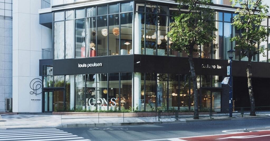
Polène, a distinguished brand hailing from Paris, specializes in crafting leather goods. Since its establishment in 2016, Polène has been retailing its products through both a flagship store and an online platform. After making its way into the Japanese market in 2020 through online sales, the brand is now gearing up to launch its very first flagship store in Asia this year.
In this project, GARDE has held a pivotal role, overseeing the local architectural aspects, including the fundamental and execution designs, project management, and the construction itself.
The design of the new Polène store, like its counterparts in Paris and New York, has been envisioned by the French designer Valériane Lazard. While the core essence of Polène’s identity remains intact, this Tokyo store will also incorporate unique elements inspired by the city, such as fixtures with urushi lacquer touches, infusing a Japanese aesthetic.
The interior ambiance of the store has been meticulously curated, featuring highlights like large-scale midnight blue art glass, a creation of the French glass artist Emmanuel Barrois. Leather-crafted ceiling light fixtures and staircase railings, along with walls finished in sand plaster with subdued tones, collectively contribute to an environment that truly encapsulates the Polène experience.
♦About Polène
Founded in 2016 by a trio of siblings, the French House of Polène has gained recognition for its collection of fine leather goods and jewelry. These creations boast original forms that beautifully marry the minimalist approach with creative expression, all masterfully crafted by skilled artisans. The meticulous handcrafting process takes place in Ubrique, a Spanish city renowned for its rich heritage in leather craftsmanship.
CASETiFY is a smartphone case and tech accessory brand that gained popularity on social networking sites after its customizable smartphone cases and Apple watch bands became a hot topic among celebrities and influencers in Japan and abroad.
GARDE was responsible for the design, local architecture, and construction of two projects: Amu Plaza Hakata, the first store to open in the Kyushu area, and Osaka, the first flagship store in the brand’s history.
■CASETiFY STUDiO AMU PLAZA HAKATA
Amu Plaza Hakata is an eye-catching space with CASETiFY monogram and logo sign.
To promote a global environmentally friendly approach, “RECASETiFY” boxes are set up to collect used phone cases, not only the company’s own products, which can be recycled.
Open Date:March 3, 2023
Address:1F 1-1 Hakata station chuogai, Hakata, Fukuoka-city, Fukuoka.
TEL:092-260-3953
Business Hours:10:00~20:00 (Business hours may vary.) https://www.casetify.com/visit-us/jp/amu-plaza-hakata
■CASETiFY OSAKA
CASETiFY’s world’s first flagship store opens in Shinsaibashi.
The store, with a total sales floor space of 103.7㎡, was designed by world-renowned architect André Fu. The design pays homage to Japanese tradition and craftsmanship, harmonizing with CASETiFY’s stylish and creative impression to create a space that is finished to perfection.
SThree K.K. is a global recruitment firm specializing in the STEM (Science, Technology, Engineering, Mathematics) field. Establishing their first office in London, SThree K.K. now has 44 offices in 15 countries around the world. GARDE was involved in the interior design, construction supervision, and FF&E coordination of their Tokyo office.
The office is located in a modern building connected to the Kabuki theater in the heart of the historical Ginza area. This contradiction sets the scene for the unveiling of this exciting workplace conceived and built in less than 6 months. The diverse and inclusive brand message of the company is captured through a multi-cultural design theme expressing strength in the sum of its parts.
The concept is inspired by the fusion of Western and Japanese culture into an open agile working environment that focuses on recruitment for the STEM industries. The project is highlighted by an ambient reception space with spot-lighted sub brands and a collection of minimalist meeting rooms. A futuristic portal then transports you to a cozy social hub complete with a billiard table, pub bar, and poker table expressing the Client’s deep UK roots.
A video of the completed office can be viewed at the following link. click here
■Project Director Profile Christopher Brooks, AIA
International Design Division, General Manager, Design Director,American Institute of Architects (AIA), Master’s degree in Architecture.
He has experience in retail, office and residential design in the United States, Japan, and other parts of Asia. His key projects are the restaurant ADD in Marco Polo Hotel Hong Kong, Bandai Namco Studios Headquarters, adidas Japan Headquarters (Asia Pacific Property Awards 2015), and MetLife Japan Headquarters (Herman Miller Liveable Office Award, IDA Gold & Silver awards 2018).
■Project Team
Nagisa Miura, Naoto Sudo, Francesco Ristori, Takanori Tsukiyasu, Daisuke Suzuki
■Scope of work
Interior Design, Construction Supervision, FF&E coordination
■Property Information
Name: SThree K.K. (Office design)
Location: Kabukiza Tower 9F, Ginza 4-12-15, Chuo-ku, Tokyo, Japan
Store area: 1,315㎡
GARDE designed the clubhouse for BAKER CIRCLE ONE, the first phase of Baker Circle, a large redevelopment complex project in the Hong Ham area by Henderson Land, the No. 1 developer in Hong Kong. GARDE designed the clubhouse for BAKER CIRCLE ONE.
The clubhouse, based on the concept of “Blooming”, employs elements with a “Japanese” feel. We designed a minimalist, fresh shared space.
On June 21 (Tue), a large-scale press conference was held for the Hong Kong media, and GARDE’s President Mr. Muro and design director, Mr. Saito, participated remotely on behalf of GARDE.
We then interviewed the design director, Arata Saito, who was in charge of the design of BAKER CIRCLE ONE’s clubhouse.
■About the design concept
First, the client asked us if we could create a design with a Japanese motif. Since a normal reproduction of a Japanese space in Hong Kong would be too colorful, we decided to provide an unusual design with Japanese elements.
In this context, we have designed an elegant space that is wrapped in an organic atmosphere such as a flower petal, while using the shades of light as the key concepts. It is a space where you can feel the 365 days of time pass and the changing of the seasons. The soft and elegant curves of the petals were used as a motif to create a fluid and gentle atmosphere through the use of materials, colors,and lighting.
For example, we did not use very strong lighting, but, rather, used a lot of indirect light. The walls and ceilings were kept as simple as possible, and the shadows of petals and greenery cast by the indirect light spread over them, giving the space a deep, restful feeling.
Of course, each season is influenced by the environment, but we hope that you will see this as a plus and enjoy experiencing each moment created by the changing seasons and time.
■Baker Circle One Clubhouse Design Features
We designed each of the three buildings as shared spaces with different functions and purposes so that friends, family, and residents can use them in their own way and with their own hobbies and interests.
Indoors, there are cultural activities such as a yoga space and library. Outdoor activities include a rooftop garden, fruit garden, BBQ site, playground, and activities such as a rooftop garden, fruit garden, BBQ site, playground, and urban farm, making it a unique and highly satisfying space.
■About Lounge Design
We have designed lounges for each of the three buildings. In this issue, we will discuss the lounge designs for two of the three buildings.
The design of the first building (Top Image), with its beautiful cherry blossom trees that seem to depict the life force of nature as is, is impressive. By eliminating the boundary between the outdoors and the indoors, we planned the space to be as spacious and rich as possible within the narrow living environment of Hong Kong.
In addition, in order to fulfill the various needs of users, the wall side is designed as a multi-function wall. This is a place where the sharing of space is strongly emphasized due to the diverse use of the space.
The staircase leading to the rooftop garden on the third floor has a bold curved design that expresses the softness of the space.
Next, the design of the second building (Image 1) was designed with the intention of creating a more Japanese feel, and the use of latticework, as well as andon-style wall surfaces, and rough-finished stones further emphasize the shadows.
By daring to switch the design of the flooring and the ceiling, we created a space where people can spend time comfortably and feel a sense of peace by giving the space a sense of liveliness.
■About Yoga Room Design
We designed a yoga room as one for cultural activities. The large windows overlooking all four sides allow plenty of natural light to pour in, while the low-brightness lighting and curvilinear design of the ceiling create a sense of openness and soft light that softly envelops the body and mind.
In addition, the warmth of the wood flooring may be described as a “yoga space in the sky” that relaxes not only the body but also the mind.
■About Library Design
The entire space is unified by the earthy tones, with fin-like wall surfaces, wavy latticework, and skylights that resemble flower petals.
From the ceiling floods a sparkling natural light similar to the brilliance of water, and the balcony space with its lush fruit garden allows you to feel the airiness of the plants. We have created a space where you can experience the luxury of being surrounded by nature while still being in the big city.
■About Art Space Design
The simple wood-based space is filled with soft natural light, and together with the various artworks, we believe that visitors will be able to feel the slow flow of time.
The ceiling is made up of rounded parts, and wooden chairs are used to incorporate a playful spirit that reminds us of the free creations we made in our childhood gardens.
We designed this space to be a gentle place where people can forget the hustle and bustle of daily life and calm their minds.
■About Staycation Room Design
With the restrictions of international travel still in place, we designed a space where people can experience “wa”, or Japanese sensibilities, which is an extraordinary experience. By adopting materials that are “wa” in terms of both sight and smell, such as tatami mats, latticework, and washi paper lighting, we were able to express a minimalist, lean, “wa” atmosphere.
■About Gym Space Design
Brilliant outside light pours in through the wide-open windows, and skylights on the exterior portions of the building create a sense of openness. Roman shades were employed to adjust the amount of sunlight.
The wall accented with soft curves is based on the motif of Japanese folding screens. We hope you can feel the “harmony” here as well.
■Desiner Profile Arata SaitoDesign Division, Design Department, Design Director, First Class Registered Architect
GARDE was involved in the conceptualization, basic planning, basic design, and supervision of the interior portion of Prince Smart Inn Kyoto Sanjo, which opened on April 4, 2022.
■Location, lobby design, and seamless service through the introduction of ICT/AI technology: these are the main features of the hotel
Prince Smart Inn Kyoto Sanjo is located within walking distance of Sanjo Station (Keihan Main Line) and Kyoto Shiyakusho-mae Station (Kyoto Municipal Subway Tozai Line), making it a very convenient location for both sightseeing and business purposes in the city.
The façade is inspired by a contemporary machiya and composed of a combination of Japanese lattice doors and protruding latticework, (indeed, characteristic features of a Kyoto machiya). Not showy, but with a sophisticated design and a beautiful sense of rhythm and movement, these elements evoke a sense of anticipation for a stay in Kyoto.
GARDE was able to design a simple and open space by creating a sense of seamlessness going from the hotel entrance to the lobby.
The lobby area, check-in area, and restaurant were also designed to become a single space. Combined with ICT and AI technology, GARDE has completed a comfortable space that matches space and functionality.
The interior design is based on the theme “learning from the past”. It features a collage and a gold leaf wall art by artists with ties to Kyoto; wood block art with images of the four deities (blue dragon, white tiger, red bird, and black tortoise) that protect the north, south, east, and west of Kyoto; and step seats that resemble the banks of the Kamo River.
Taken together, all these features create a one-of-a-kind space where visitors can feel the modern traditions, as well as cultural flavor unique to Kyoto. In other words, a first-hand experience of the sophistication of modern art design.
A new hotel was born in Sanjo, Kyoto, a popular destination visited by many people as a base for sightseeing, business, and other activities. While letting visitors feel the long history and culture of the city, this hotel offers a smart and functional space, all the while utilizing the latest technology.
■Design concept/keywords are “irregularity,” “nostalgia,” and “gap”.
The façade, a contemporary take on the traditional machiya, is designed to retain a sense of the world, while gently controlling the view. A “noren” screen (Japanese curtain-like screen) was installed to invite guests into a simple and modern lobby.
As you enter, a huge touch screen appears in front of you, and an earthen floor leads you to an automatic check-in counter… A stress-free, streamlined flow line suddenly leads to a courtyard reproducing a lush mountain forest, giving you a magical sensation as if you were looking at a painting.
■The theme for the design of the main space is “learning from the past”.
Non-organic and modern industrial materials such as concrete and deck plates are mixed with materials and furnishings such as bare lighting and old wood big tables that are more than 100 years old from lumbering, thus expressing the passage of time with warmth and nostalgia, as well as a sense of renewal.
■Spatial Design: Sanjo’s “learning from the past”
For this project, GARDE has collaborated with an artist with a deep connection to Kyoto. The spatial theme was Sanjo’s “learning from the past”, a place where traditions and culture are alive and sound.
By allowing artworks and expressions to coexist in the space, GARDE has created a place that stimulates the sixth sense, which cannot be summed up in a single word “art space”.
◆Project Members
Arata Saito GARDE esign Division, Design Department, Design Director, First Class Registered Architect
After working mainly on brand-name design and construction projects in Tokyo, he joined the Asia Pacific Division of the Hong Kong office in 2013. Mainly working within China and Southeast Asia, he designed the VIP area of K11 in Guangzhou, China, The Royal Park Canvas – Ginza 8 etc. He was involved in a wide range hospitality spaces as well as commercial spaces. In 2020, he returned to the Tokyo Head Office and continues to work mainly on overseas projects.
After joining the company in 2016, he worked in the PM Section of the Brand Business Division, where he managed the interior design work for imported brands opening stores in Japan. In 2019, he joined the Design Section of the Brand Business Division, where he worked as a local architect for imported brands ranging from apparel to cosmetics. In 2021, joined the International Design Division, where he works as a designer on a variety of projects in Japan and abroad, focusing on apparel stores, large-scale commercial facilities, and hospitality design.
Artist #1. Nori Yokoyama Art Director/Graphic Designer
A 2017 graduate from Graphic Design Department of Tama Art University. In that same year, Yokoyama has Established TANT Inc.He has been active in a wide range of fields including print media, web, video and space, focusing on art direction, graphic design, and illustration. Over his career, he has received numerous awards including DFA Design for Asia Awards, GOOD DESIGN AWARD, and Tokyo Business Design Award. http://noriyokoyama.com/
●Comments from Mr. Yokoyama
Throughout Japan’s long history, Kyoto has especially been a symbol for Japanese culture.
In particular, the area around Sanjo is surrounded by great enthusiasm, where various cultures have long intersected with tradition as its base. It is a place that truly embodies the phrase “learning anew from the past,” and I wanted to paint a huge wall art that would convey this concept directly to visitors.
I printed, drew, collaged, and applied foil onto Kyo Washi, a Japanese paper. Calligraphy and art come from various historical backgrounds, and I included contemporary prints depicting entertainment and culture scenes, using popular paper, to reconstruct “Kyoto” as it was originally built: over a long period of time, and with an overwhelming amount of work.
Artist #2 Hitoshi Tetsuhiko ASSOCIATED ARTS INC. representative/art director
Established Associated Arts, Inc. in 1991.
Based on his unique perspective of fusing architecture and art, Tetsuhiko has participated in art projects for public facilities, housing complexes, offices, educational facilities, hotels, hospitals, sports facilities, commercial facilities, etc. He has been involved in more than 300 projects as a producer and art director. Major projects include “Akita Prefectural University,” “Shinagawa Central Garden,” “Keio Plaza Hotel Aubade Hall,” “Gora Karaku, Hakone,” and many more.
●Comment from Hitoshi
This artwork is based on Yurina Kira’s work “Stock213” and is customized for the theme of this exhibition by means of reconfiguration and resizing. The reason why we chose “building blocks” is that this shape makes us nostalgic for our childhood. On the other hand, we believe that piling up trees pays homage to the culture and city of Kyoto, which has existed for more than 1,000 years. This time, we used wood block art to represent the four deities that protect the north, south, east, and west of Kyoto (Genbu in the north, Suzaku in the south, Seiryu in the east, and Byakko in the west), as well as the Kyoto Imperial Palace. We hope that through our artwork, visitors will experience the wonder of Kyoto and the depth of Kyoto’s nostalgia, which respects cultural diversity while transforming the energy of each into equilibrium, harmony, and new values.
■Lobby/Restaurant Area Design: A mix of old and new, a space of difference, nostalgia, and separation
Gently reflecting on the Big Table, with a mosaic of old zelkova lumber more than 100 years old since its sawing, is the light from a chandelier made by LASVIT – a lighting fixture with a sculptural beauty created by traditional Bohemian crystal craftsmanship and innovative technology.
By meticulously calculating and accumulating the different snags and feels of the old and new in a beautiful mix, a unique space like no other has been created.
It is also GARDE’s hope that a new community will be nurtured from this place through the power of spatial design.
■Guest Room Design: A place for healing, it is the starting point of everyone’s stay in Kyoto.
The key visual effects by Prince Smart Inn brand are the sloping design on the floor and the interlocking wallpaper on the walls, designed to make the guestrooms look more spacious and stylish.
Additionally, the use of wallpaper with Higashiyama motifs gives guestrooms a Kyoto-Sanjo feel to it. GARDE has designed the rooms keeping in mind the theme of creating a space where guests can enjoy their stay in the historical city more actively than ever before, taking the simplicity of the rooms as a plus.
We hope that through our design, many people will come and go at Prince Smart Inn Kyoto Sanjo, and that this will become part of the new scenery (history) of Kyoto Sanjo and be written in its history.
◆ Prince Hotel “Prince Smart Inn Kyoto Sanjo”
This hotel is conveniently located in the center of Kyoto, an approximate 8-minute walk from Sanjo Station (Keihan Main Line), and a 5-minute walk from Kyoto Shiyakusho Mae Station ( Kyoto Municipal Subway Tozai Line).
The five-story guest room building has 137 guest rooms and is the next-generation hotel brand of Prince Hotel. It offers a modern machiya-style exterior, a contemporary and innovative lobby design with a Kyoto motif, and a seamless service through the introduction of ICT and AI technology.
This will be the second location in Kyoto City, following the Prince Smart Inn Kyoto Shijo Omiya, which opened on May 31, 2021.
◆About the Facilities
Official name: Prince Smart Inn Kyoto Sanjo
Location: 325 Maruya-cho, Sanjo-Agaru, Gokomachi-dori, Nakagyo-ku, Kyoto City
Site area: approx. 1,025.83 m2
Legal gross floor area: approx. 4,149.73 m2
Structure and scale: Steel-frame structure, 5 floors above ground
Completion of construction: January 31, 2022
Number of guest rooms: 137 (105 twin rooms / 32 double rooms)
Guest room area: 16.27 m2 ~ 25.98 m2
Ancillary facilities: Restaurant (66 seats *including lobby area), Laundry