GARDE designed the first store after the rebranding of Chinese luxury women’s fashion brand “LANCY” and the first store of the newly launched second line “L By LANCY”, starting from the conceptualization, basic planning, basic design, implementation design and supervision.
Since its establishment in 2000, LANCY has been a high-end women’s fashion brand that offers fashion for every occasion, targeting sophisticated urban women with charm, experience, and influence. Competition in the Chinese women’s fashion market is becoming increasingly fierce as average incomes rise, needs diversify, and markets become more fragmented. While the trend toward casual and street fashion continues, there is also a growing emphasis on “brand value”, and there is a stronger demand for brand reliability, not just luxury. In response to this trend, the mission was to redefine the brand value of LANCY and to brand L By LANCY, which had been handled by the same store, as a new brand.
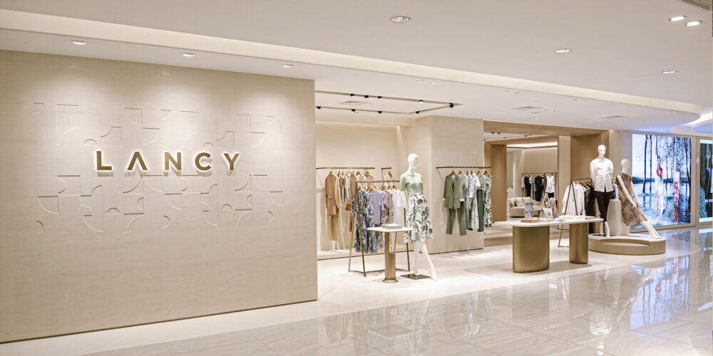
LANCY
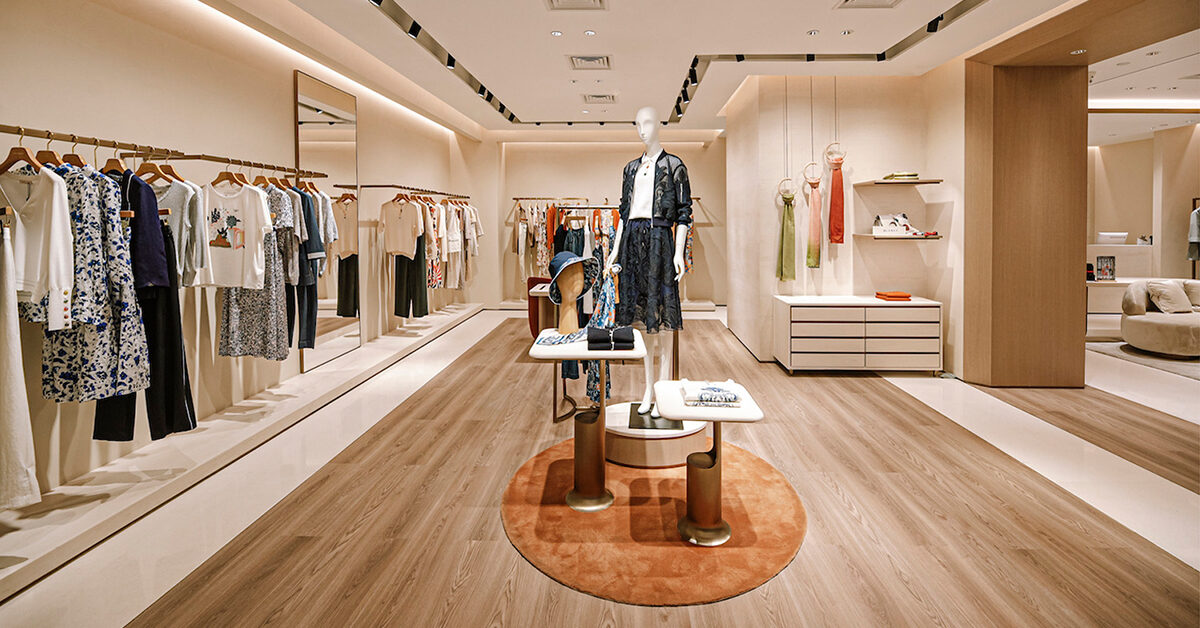
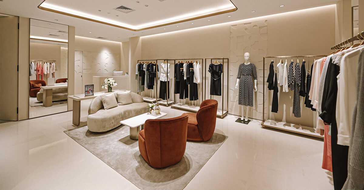
We aim to support sophisticated women living in the city by dressing them with unique styles. We also hope to deliver love and power to the world while increasing consumer empathy for the brand value. The concept of the store design is “My place, My time”. With the image of a “mansion” where the girls live, we created a sophisticated yet relaxing space by using high-quality materials and bright, warm tones throughout. In the store, a “gate” is placed as a symbol of a “mansion,” and by changing the material of the floor, a space with different expressions to create to atmosphere of the space. We were conscious of carefully expressing delicate femininity with fine details by creating a luxurious space using the brand’s original LC pattern. We believe that customers should feel what the brand represents as soon as they step into the store.

 Inside the LANCY store
L By LANCY
While maintaining the elegant and sophisticated worldview of LANCY, the brand targets a wider and younger audience. Based on the design concept of “My place, My time”, the space is designed to communicate the glitz and glamour of the brand. Their customized chandelier features the L By LANCY logo displayed in the center of the store that creates a very festive and inviting atmosphere.
 Inside the L By LANCY store
Scope of work
Concept planning, basic planning, basic design, implementation design, supervision by Garde
No related posts.

